What Visuals to include in your press kit?
We decided to play the role of Press Kit Rangers this time.
My artist colleagues have decades of combined expertise designing marketing materials & assets.
Yours truly is heading into the 5th year as a games journalist.
So what better combo to teach you all you need to know about your press kit visuals?
Exactly.
There’s none.
“To think like the press… one must become the press 😌”
I know, I know. It sounds like some random BS I came up with on the spot.
What I mean is that you need to think about the most common scenarios where press, magazines, and journalists will use the assets you provide them with.
You can probably hint at the most common use case: within the articles themselves. There’s no rocket science here.
Articles aren’t books that someone will read line by line.
Readers need moments of relief in between sections and paragraphs.
For example, including quality screenshots from the game helps us, journalists, give our readers a break.
They can also be used to sustain our arguments about the game’s visual direction, UI elements, gameplay features, etc. etc.
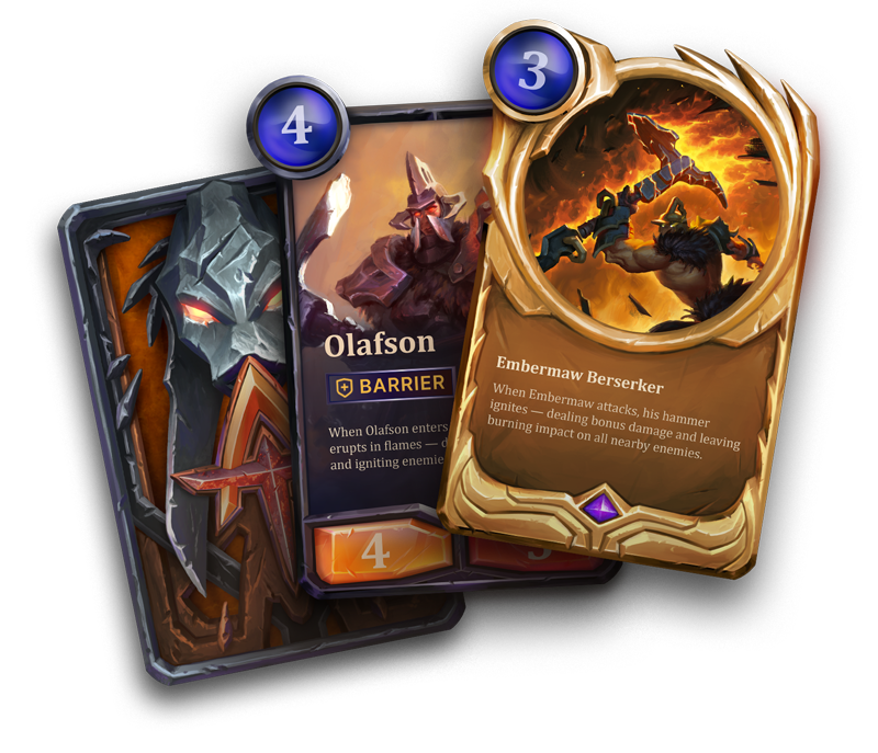
Another context you need to think about is video content published by media.
It’s not 1609 anymore. We’re past the time when journalism was just about writing.
Outlets have dedicated YouTube channels these days where they publish their coverage and game reviews. Seeing the game in action with voiceover commentary has already become a staple.
What you can do in this regard is provide us with isolated assets like characters, buildings, special effects, and all the good stuff that we can use for thumbnails.
You’ve learned about a few places where journalists use the assets you provide in their work. Now we’ll go over each one of these assets, how they’re used, and what to keep in mind when designing them.
But not before we discuss one crucial thing…
How the heck do I get the press to notice me?
I’ve already touched upon this briefly in our previous article, How to make your game pop on Steam.
It’s a useful read in itself if you need help standing out in a market full of competitors.
Essentially, I’m looking at a few key elements when receiving a request to cover a game:
#1 Key Art
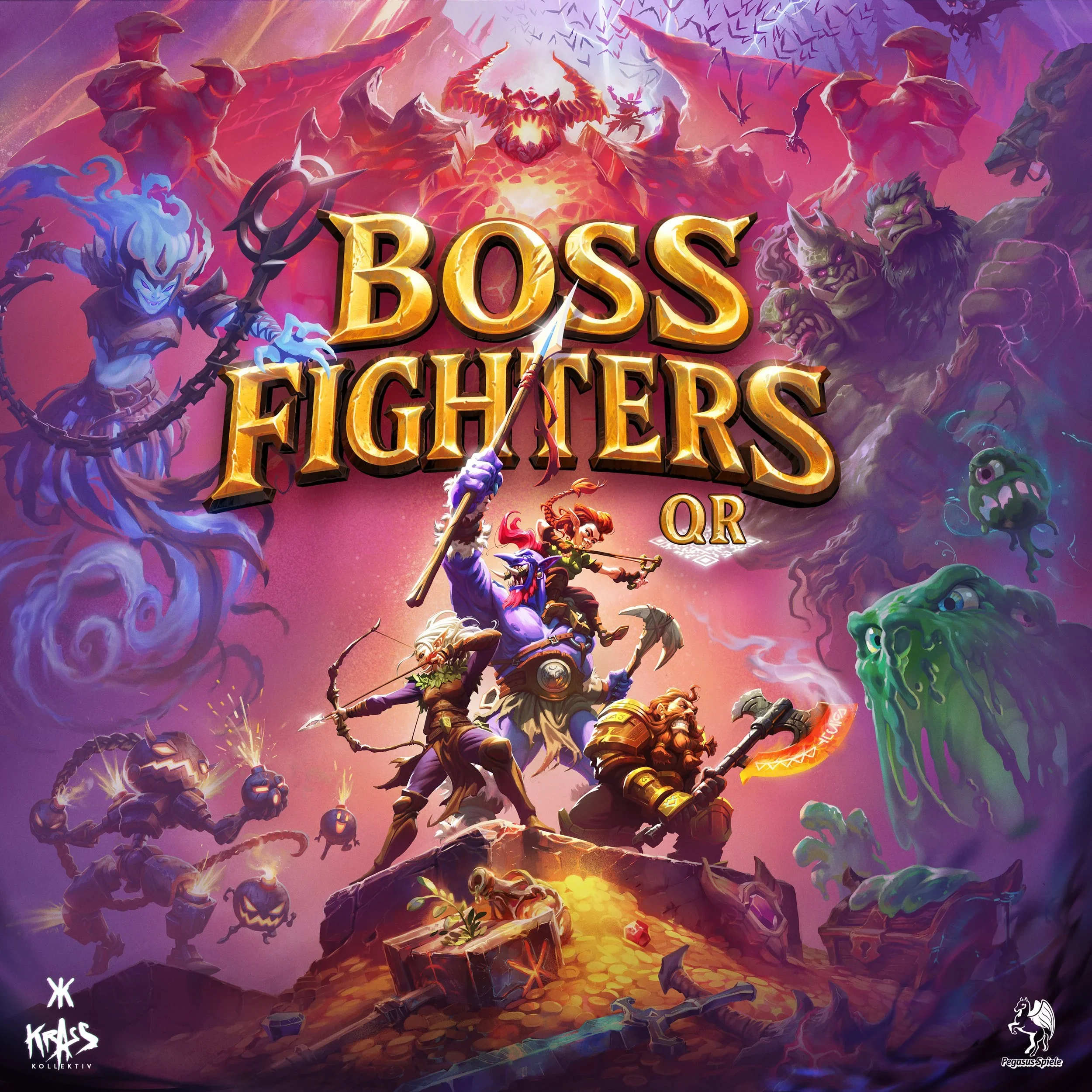
In my eyes, this is your business card before that crafty hook from the email subject.
We already expect to be contacted to cover games and open most of the emails out of habit.
What’s important is inside.
What your key art does is help us sample your visual identity.
Do I understand what’s happening there? Or is it just an amalgamation of assets, text, and backgrounds?
Do your characters speak to me?
Do I like your color palette?
It’s the most basic element that answers the question:
“Do I want to read/click further?"
#2 Steam Page
No offense to my hardworking PR friends (I love you ♥), but we rarely read the mumbo jumbo in the emails we receive.
The immediate thing I do after the vibe check from the Key Art is to search for a link to that damn Steam page.
Why? Because most Key Arts are misleading these days.
If it doesn’t match the screenshots and gameplay from your Steam page, you already have one strike from me.
You’re either trying to trick the audience.
Or you don’t know how to maintain visual consistency between your game and your promotional materials.
Our guys actually offer support for early visual development, if you want to take care of that problem before it even appears.
Anyway. Assuming that what we see is what we get, I need to check your gameplay.
(If you don’t have gameplay yet) I need to see screenshots to determine whether I want to spend my limited time covering your game rather than someone else’s.
Or, in the case of outlets, they need to determine if they have someone who’s available and/or willing to cover it.
#3 Trailer
This one is usually the make-or-break part.
A good trailer tells me that you know how to showcase your game’s strengths.
It tells me that you know your target audience and how to communicate with them.
And it reinforces that what people see on your Steam page is what they’ll get.
The alternative is a trailer that looks nice but says nothing.
Or not even the looking nice part.
Trust me. I have… seen things.
#4 Ways to reach out
Tell me how I can get hold of you if I want to play your game and cover it.
Or who I should bother for interviews.
Some people even include game keys alongside their coverage requests.
I personally advise against it. I encourage you to use request forms or ask people to reply to request a key.
It limits the risk of them running away with the keys.
And it allows you to screen them.
#5 Press Kit
This is the way to the heart of a journalist who will cover your game.
The truth is that properly documenting a game review takes time.
It mostly comes down to taking many breaks to take notes.
If I need to fragment my gameplay further to take screenshots… that won’t make me happy.
Having gameplay screenshots and GIFs already available makes our lives easier.
While it is not a dealbreaker if you have just a few of these
Now you know how to get the journalists’ attention.
It’s time to learn how these assets are used and what to keep in mind when designing them.
Designing Visuals for Press Kits
Key Arts
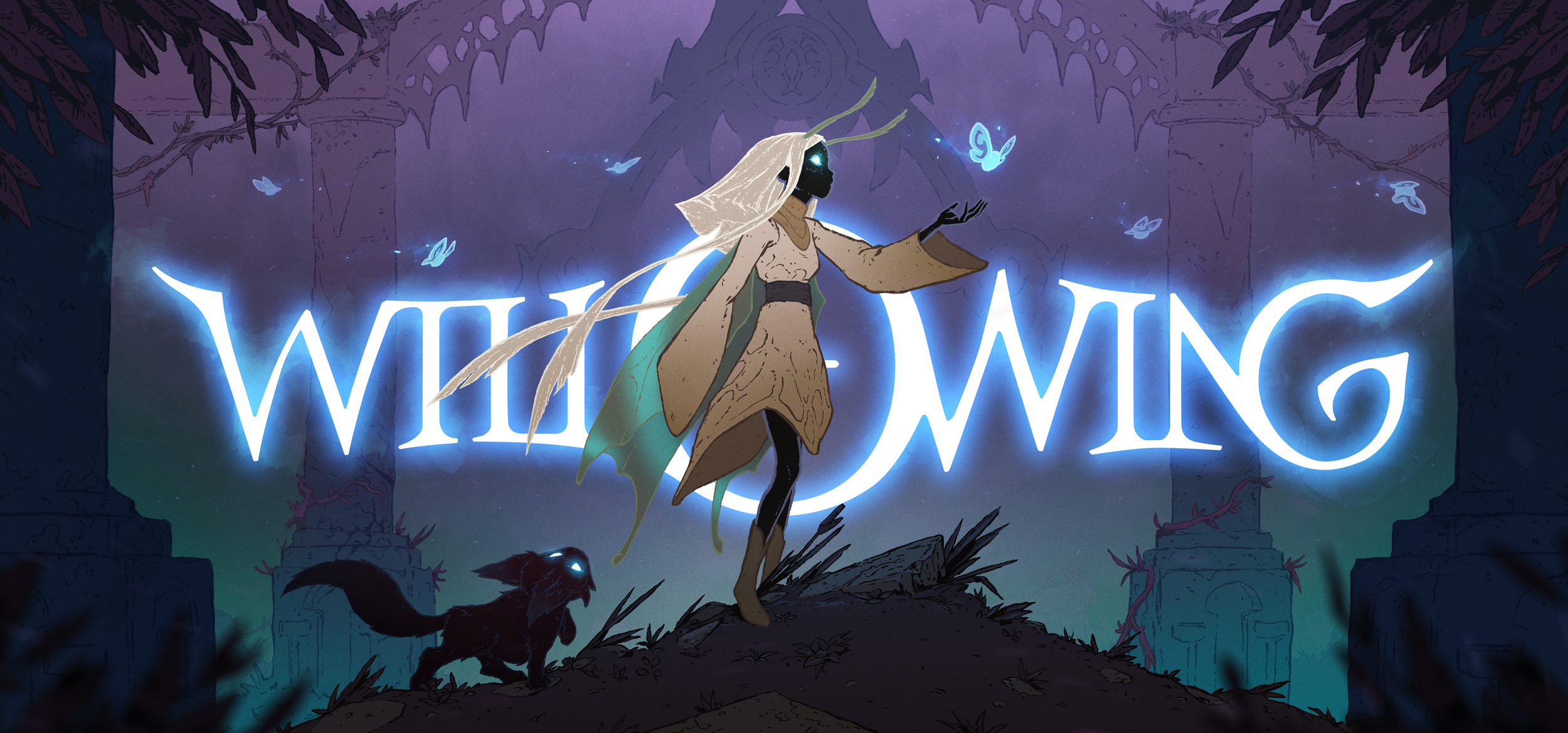
Where are they used?
Inside emails asking for coverage to grab attention.
As the cover image for articles or the thumbnail for videos, for the same purpose.
On social media, either as part of the cover images or thumbnails, or used independently.
What to keep in mind?
They’re like an elevator pitch.
They tell what your game is about before someone reads about it.
So you want it to depict key elements from the game that are coherent with its visuals.
You want these elements to tell the story in itself.You also want to work on the typography of your title.
Fancy hand-drawn text is pointless if people can’t read it.Size matters.
The usual Full HD resolution of 1920×1080 is standard for Key Arts.
You can always go the extra mile for 2K or 4K variants, but it’s not a must or a priority.What is a priority is making sure that you have variants that fit different social media platforms and devices.
You’d be surprised how the requirements vary on each platform for either landscape or portrait images.
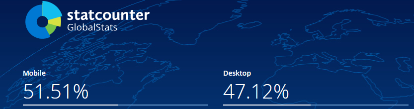
Global usage of the the Internet, Source: statcounter
Not to mention that having portrait versions for mobile is a must, since more than 50% of the internet traffic comes from phones.
And last but not least, keep it in your pants with that file size.
You don’t want to mess the website load times for the outlet.
But most importantly, each platform has an upper limit for uploads.
It can go as low as 3 MB for LinkedIn images.
Or as generous as 20 MB for TikTok images.
To logo or not to logo?
The answer is: have both versions available.
Key Art without a logo can be used as is for players to recognize your game when they check the outlet’s articles.
But many outlets like to add their own titles, visuals, and typography when creating preview images and thumbnails.
Having versions without logos makes it easier for them.
Screenshots and GIFs
Where are they used?
Inside articles.
On socials, to get the right audience interested in clicking to read more.
What to keep in mind?
A healthy mix.
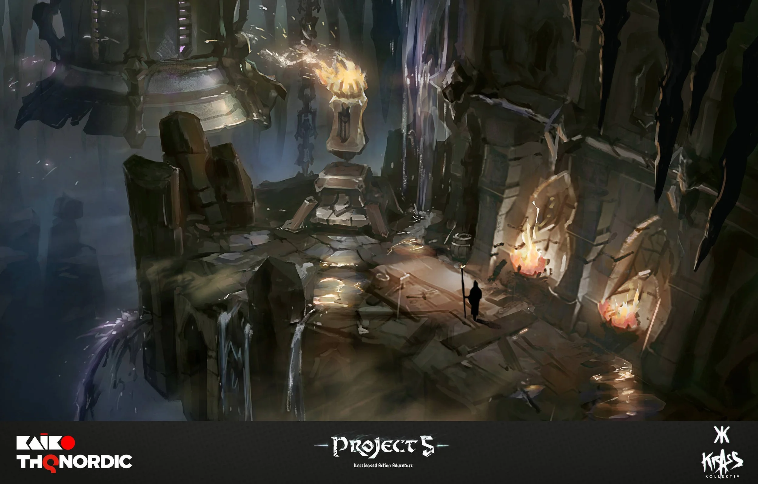
You will want to include screenshots & GIFs that show what the gameplay looks like, how the UI looks and behaves, and how the environments look without any characters.
If you’re feeling fancy, you can also add GIFs that are cut from your cutscenes.
Size still matters.
First of all, having Full HD images is still a requirement if you want players who read the articles to get a good idea of your visuals without squinting at them.
Second, you want more than a couple of images and GIFs.
As we mentioned way back, images are both a way to give the audience a break from reading and a way to sustain a journalist’s point about an aspect of your game.This is just an example: We can’t talk about the UI in skill tree menus if you only have photos of the UI for inventory and equipment.
Keep them up to date.
You’re developing a game. So of course you’ll update it, add new content, redesign visuals and mechanics, etc.
You’ll also go through different development stages: alphas, betas, early access, final release.It’s important to separate screenshots and GIFs into folders for each of these updates and development stages.
You don’t want people showcasing what the game looked like in beta on the release day, do you?
LOGOS & THUMBNAIL ELEMENTS

Where are they used?
Video thumbnails.
Promotional materials for events and interviews that the outlet organizes with your team.
What to keep in mind?
Multiple logo variants never hurt.
Generally speaking, you want at least two variants for both game and studio logos.
One for darker backgrounds.
One for lighter backgrounds.Different thumbnail elements never hurt either.
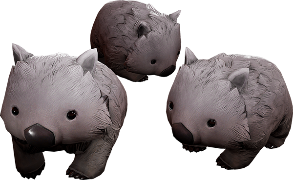
Important characters, NPCs, props… you name it.
Providing isolated elements like these makes it significantly easier to create video thumbnails.
TRAILERS
We could honestly go on an entire tangent just about trailers.
If you want to get into all the technical stuff, we have a dedicated page just for that here.
We’ll also prepare a specific article that tackles everything you need to know about trailers, since they’re not used just for Press Kits.
Keep an eye out for that one 😉
This sounds like a lot of work
It sure does. And it sure is.
Just like with game art, the visual assets for your Press Kit tread a fine line between looks and functionality.
I won’t blame you if creating your Press Kit sounds scarier than you thought.
But just having the knowledge we share with you puts you at an advantage.
Besides, you can always hit us up in the contact form below if you want us to handle it for you.
We know our way around marketing & press materials.
You’re safe with us.
Either way, we wish you luck in using all this information to make the most out of your Press Kits.